🛑 The Problem I Keep Seeing
On a massive Angular monorepo I worked on, we had a single Button component used by 10+ teams. Everything was going well until one team reported a visual bug where the button’s internal layout was broken.
The culprit? A developer had passed a utility class for grid layout (className="col-span-2") that unexpectedly applied to the root of our component, blowing up the internal Flexbox layout we relied on.
The insidious source of the bug was one innocent-looking line inside our component: {...props}.
And to be fair, almost nobody adds that line thinking, “Let me ruin encapsulation today”. It usually starts as a small convenience: “I just want onClick, aria-*, data-* to work without wiring everything manually.” That tiny shortcut quietly turns into an uncontrolled API surface.
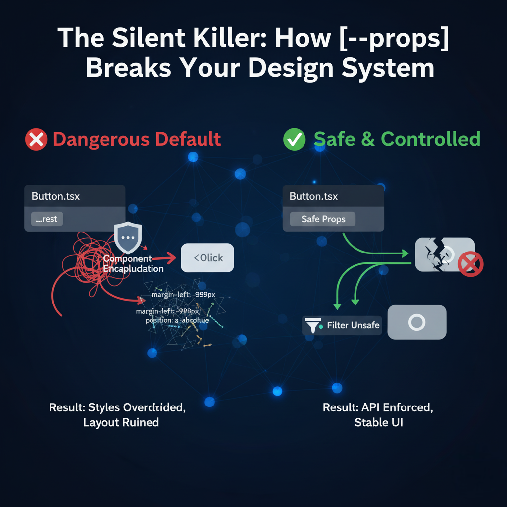
💥 Before: The Dangerous Default
When you use the spread operator ({...props}) or collect rest arguments (...rest) on your root DOM element, you allow every possible HTML attribute to land there.
This means a consumer can do this:
<Button size="large" className="absolute top-0" />That absolute top-0 will always win over the styles defined in the Design System, making component behavior and layout unpredictable.
In a small product component in a single app, that might be “good enough”.
In a design system shared across dozens of teams, it’s an attack surface.
❌ The Problem Code (Violates Encapsulation)
The component unintentionally accepts arbitrary CSS classes, breaking the Design System contract:
// Button.tsx (The Bad Way)
interface ButtonProps {
  variant: "solid" | "ghost";
  children: React.ReactNode;
  // Note: We don't list 'className' but {...props} allows it!
}

const Button = ({ variant, children, ...rest }: ButtonProps) => {
  const baseClasses = getVariantClasses(variant);

  // 🛑 DANGER: Passes everything down to the root element.
  return (
    <button className={baseClasses} {...rest}>
      {children}
    </button>
  );
};
One innocent-looking {...rest} and suddenly any consumer can:
- Override your layout (
flex→grid,inline-flex, etc). - Change positioning (
absolute,fixed,sticky). - Break sizing (
w-full,h-screen, etc). - Inject styles you never accounted for.
🧭 When {...props} Is Maybe Okay
Context matters.
-
Feature component (single app):
You and your team own both the component and all usages.{...props}is still risky, but the blast radius is smaller and easier to audit. -
Design system / shared UI kit:
Multiple teams, multiple codebases, different levels of discipline. Here,{...props}becomes a governance problem, not just a code-style preference.
As your component’s consumer count grows, the cost of “just spread props” grows non-linearly.
✅ After: Enforcing the API (The Senior Fix)
Senior engineers treat component props as a strict public API. We must actively prevent unwanted DOM attributes from landing on the root element.
The easiest way to achieve this is the Controlled Props Filter pattern:
- Explicitly wire only the props you want.
- Optionally allow safe passthrough props (like
aria-*,data-*). - Filter out dangerous ones like
classNameandstyleby default.
✅ The Senior Fix (Enforced Encapsulation)
// Button.tsx (The Safe Way)
interface ButtonProps {
  variant: "solid" | "ghost";
  children: React.ReactNode;

  // Explicitly allowed props:
  onClick?: (event: React.MouseEvent<HTMLButtonElement>) => void;
  type?: "button" | "submit" | "reset";

  // Optional, controlled overrides:
  disabled?: boolean;
  "aria-label"?: string;
}

const Button = ({ variant, children, ...safeRest }: ButtonProps) => {
  const baseClasses = getVariantClasses(variant);

  // For a simple project, explicitly filter out the dangerous ones:
  const { className, style, ...filteredRest } = safeRest;

  // ✅ SAFE: Only filtered/controlled props land on the button
  return (
    <button className={baseClasses} {...filteredRest}>
      {children}
    </button>
  );
};
Key idea: consumer code can’t accidentally pass className or style to the root.
If you want even more control, you can plug in a small utility that:
- Allows only specific HTML attributes (
data-*,aria-*,id, etc). - Strips everything else.
🎛 Controlled Style Overrides (Without Chaos)
“I still want consumers to override styles sometimes.”
Totally valid. The trick is to make that explicit and scoped, not accidental.
Some options:
1. Provide a slotProps / rootProps API
interface ButtonProps {
  variant: "solid" | "ghost";
  children: React.ReactNode;
  rootProps?: React.ButtonHTMLAttributes<HTMLButtonElement>;
}

const Button = ({ variant, children, rootProps }: ButtonProps) => {
  const baseClasses = getVariantClasses(variant);

  // Filter here if needed:
  const { className, style, ...restRoot } = rootProps ?? {};

  return (
    <button className={baseClasses} {...restRoot}>
      {children}
    </button>
  );
};
Now when someone overrides styles, it’s intentional:
<Button variant="solid" rootProps={{ "data-tracking-id": "hero-cta" }} />You can define a rule like:
“We only allow styling overrides via
rootPropsand only for specific components.”
2. Provide variant-level hooks
Sometimes the right answer is: “If you need a different look, ask for a new variant, not an ad-hoc className”.
That’s a design system governance question, not just a React question.
🔑 The Governance Rule
NEVER use {...props} on a design-system component’s root element without:
- Explicitly defining what props are accepted.
- Explicitly controlling how style and layout can be overridden (if at all).
If you must allow consumers to pass down HTML attributes:
- Use a dedicated prop: e.g.
rootProps,slotProps, ordomProps. - Filter aggressively: always strip
className,style, and anything that can break layout, unless explicitly allowed.
This is what separates a “collection of components” from an actual Design System.
🎁 Artifact: The Prop Filtering Utility
This pattern is non-negotiable for stable Design Systems. It buys you stability and predictable maintenance.
The Custom Filter Utility
Want the universal TypeScript utility function I use to automatically filter out unsafe props from component spreading? It works with React, Vue, or Angular.
Download Prop Filter Utility (Free)
🧱 Conclusion: Time to Reclaim Control
Component stability is the foundation of Developer Experience. Stop letting accidental style leakage destroy your hard work. Enforce your API contract rigorously and make overrides explicit, not accidental.
I’m curious: How does your team currently handle style overrides in your design system?
- Do you allow
classNameon all DS components? - Only on some?
- Or is everything locked behind variants / slot props?
If you have a rule (even an unwritten one), write it down — that’s your design system governance starting point.